.png)

Key Takeaways
A poorly designed SaaS website doesn’t just hurt conversions. It increases acquisition costs (CAC) and leads to higher churn.
SaaS companies operate in a high-stakes environment with complex buying committees and long sales cycles. You've already invested significant resources to get potential customers to your website. But if they encounter confusing navigation, an unclear value proposition, or a subpar user experience, that effort goes to waste. Even if some convert, a weak website can attract the wrong-fit customers, leading to high churn and lost revenue.
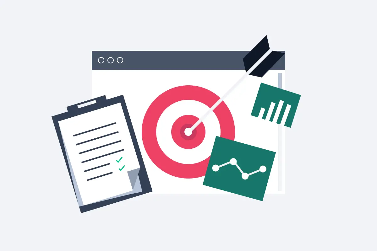
The three key elements of a good SaaS website are design, navigation, and content. A study by British Researchers found that 94% of website first impressions are design-related.
Your website is more than just a digital storefront. It shapes how prospects perceive your SaaS product. But with countless design factors and industry-specific nuances to consider, building an effective site can feel overwhelming.
This is where agencies like Tripledart can help. As a SaaS website design agency with over 100 clients, we understand what makes SaaS websites succeed. Here are our top 10 recommendations to help you create a website that attracts, converts, and retains the right customers.
SaaS Website Design: How to Ace UI/UX
A well-designed UI/UX lends to a seamless and intuitive user experience is crucial for driving adoption, reducing churn, and ultimately, boosting conversions. Here are some UI/UX elements that make a SaaS website design successful:
1. Branding and visual appeal
Your website's visuals should instantly communicate your brand identity. Consistent use of your logo, color palette, typography, and imagery creates a cohesive and professional look. This makes the website more memorable and helps you stand out in the crowded marketplace.
2. Easy Navigation
If a physical storefront is chaotic, with no clear sections, or it is difficult to navigate, a customer is likely to turn away. The same is applicable for your website. Good website navigation makes it easier for customers to find the information they are looking for and encourages users to explore your website further, increasing engagement and conversions.
3. Mobile responsiveness
As of November 2024, 64.04% of all internet traffic comes from mobile devices. Ignoring mobile responsiveness means alienating a significant portion of your potential audience and damaging your brand's reputation. A responsive design adapts automatically to different screen sizes, ensuring a consistent and user-friendly experience regardless of how visitors access your site.
4. Loading Time
With short attention spans and high internet speeds, users expect webpages and websites to load quickly, and slow loading times can lead to frustration and high bounce rates. A fast-loading website not only improves user experience but also boosts your search engine rankings, as search engines prioritize speed as a ranking factor.
5. Personalization
Personalization is not only a feel-good factor is helps improve conversions as well. By showing visitors content and offers that are directly relevant to their needs, you increase the chances of them taking the desired action, whether it's signing up for a trial, or requesting a demo.
SaaS Website Design: Elements for Better Conversion
A beautiful website is useless if it doesn't convert visitors into paying customers. These key elements will help you design a SaaS website that drives conversions and boosts your bottom line:
1. Clear messaging
SaaS products can be complex. Clear messaging simplifies the complex, making it easy for visitors to understand your product's features and how they work. This reduces confusion and friction in the user journey, encouraging them to explore further.
2. Pricing page
Pricing is a key factor in purchasing decisions. A well-structured pricing page makes it easy for potential customers to compare plans and choose the option that best fits their budget and needs. Clearly outlining the features and benefits included in each tier helps potential customers understand the value in each plan.
3. Social proof
Testimonials provide a human touch to an otherwise impersonal purchase process. They offer social proof, demonstrating that real people have used your product and achieved positive results.
4. Call to Action (CTAs)
CTAs act as signposts, guiding visitors toward the action you want them to take. Whether it's signing up for a free trial, requesting a demo, or contacting your sales team, CTAs make it clear what you want users to do next.
Top 10 SaaS Website Designs for Inspiration
Based on the parameters mentioned above, we’ve curated the following list of top SaaS website designs:
1. PushOwl
PushOwl empowers e-commerce brands to boost sales and engagement through targeted push notifications. They offer a platform to automate personalized push campaigns, recover abandoned carts, and nurture customer relationships.
Clear value prop
Right from the heading on the home page to the numerous sections highlighting the product features, PushOwl does a great job helping website visitors understand their offerings and how their product features help eCommerce store owners increase profitability. It leaves no room for any guesswork as the messaging explains different use cases supported by illustrative visual elements.

Social proof
Pushowl smartly incorporates social proof, including prominent 5-star reviews and case studies on their homepage. But what truly sets them apart is their strategic use of data and figures on individual feature pages, like the "Activate" card. Right away, visitors encounter compelling statistics and quantifiable results that reinforce the tool’s impact. This targeted approach directly addresses purchase considerations, emphasizing the ROI of using PushOwl.

By presenting clear, data-driven value, the page encourages visitors to keep scrolling, bringing them closer to conversion.
Emphasis on self-service
Pushowl understands that early in the sales cycle, potential customers often prefer self-directed research. That's why they've created a website experience that combines interactive design elements (like the motion visuals on their "Why" page) with extensive help documentation and FAQs. This allows users to explore the product in detail, get their questions answered, and experience its value firsthand—all without the initial pressure of contacting a sales representative. This approach can significantly increase conversions by fostering trust and product understanding.
2. BBMatrix
BBMatrix offers AI-powered solutions for optimizing marketing campaigns, helping businesses improve ROI and achieve better results.
Minimalistic design
BBMatrix employs a clean and minimalistic design, creating a visually appealing and user-friendly experience. The clear visual hierarchy guides the user's eye, emphasizing key messaging and making it easy to digest information. This uncluttered approach allows visitors to focus on the core value proposition and understand the benefits of BBMatrix's AI-driven solutions.
Placement of CTAs
BBMatrix strategically places clear and compelling CTAs throughout the website. Whether it is a “Talk to an Expert” button or a “Know More” option, these CTAs are designed to capture key moments throughout the customer’s website visit.

FAQs section
BBMatrix uses its website as a powerful tool for objection handling. It features dedicated pages for each industry it serves, complete with comprehensive FAQs that directly address potential customer concerns. By proactively answering key questions, these pages help visitors evaluate the platform with confidence and move closer to a purchase decision.

3. InsightIQ
InsightIQ provides AI-powered marketing analytics and attribution solutions, enabling businesses to understand their marketing performance and optimize campaigns for better ROI.
Highlights product features
InsightIQ effectively highlights its product features through clear explanations and compelling visuals. The website showcases the platform's key functionalities and benefits, making it easy for visitors to understand how InsightIQ can help them improve their marketing performance. The focus is on demonstrating the value proposition and how the AI-driven insights translate into tangible business outcomes.

Pricing page
InsightIQ's pricing page is transparent and straightforward, outlining the different pricing tiers and what each includes. The page clearly communicates the value offered at each level, enabling potential customers to easily compare options and choose the plan that aligns with their needs and budget. This transparency simplifies the decision-making process and builds trust.

Footer
The website footer is comprehensive and well-organized, providing easy access to essential information. Beyond the usual links, it prominently features their free AI resources, demonstrating their expertise and establishing them as a valuable resource for the industry. This strategic approach strengthens their brand image and builds trust with potential customers.
4. Wadzpay
Wadzpay offers a global payment orchestration platform designed to simplify and optimize payment processing for businesses worldwide.
Resources
Wadzpay offers a rich collection of resources readily accessible from their website. These resources, including blog posts, white papers, and case studies, provide valuable insights into the payments landscape and showcase Wadzpay's expertise. Given that payments are a sensitive matter, requiring a high degree of trust, this commitment to knowledge sharing is particularly important.

Emphasizes user goals
Wadzpay's website clearly emphasizes the goals and needs of its target audience. Their home page has sections that highlight the different financial services they offer such as wallets, payment gateways, etc, and helps each website visitor easily find the product and features they may be interested in.
Fast loading
Wadzpay's website is designed for speed and efficiency. The fast loading times ensure a smooth and seamless user experience, preventing frustration and encouraging visitors to explore the platform's offerings. This focus on performance reflects Wadzpay's commitment to providing reliable and efficient solutions for its customers.
5. Intercom
Intercom offers a suite of customer communication tools, including live chat, chatbots, and email marketing, designed to help businesses connect with their customers and drive growth.
Design language
Intercom sets itself apart from typical B2B/SaaS designs with a visually engaging website. Pages like the customer support section feature bold visuals and a distinct aesthetic that reinforce its brand identity as innovative and user-focused.

Social Proof
Intercom effectively uses social proof to build trust and credibility. Their website highlights key statistics and customer success stories. What's particularly compelling is the way they present their G2 scores alongside those of their competitors. This allows potential buyers to easily understand how users have favored Intercom.

Interactive exploration
Intercom offers a self-service demo that allows visitors to interact with the platform directly on its website, eliminating the need for a traditional free trial. This live interactive demo provides an in-depth look at the interface, guiding users through key features and workflows in real-time. By offering a hands-on experience, Intercom helps potential customers understand its functionality, usability, and overall value before committing to a purchase
6. Friday
Friday offers a platform designed to streamline team meetings and improve productivity. Their tool helps teams create agendas, track action items, and centralize meeting notes, fostering better communication and collaboration.
Minimalistic design
Friday's website likely employs a clean and minimalistic design aesthetic. This uncluttered approach helps visitors quickly understand the platform's core value proposition without feeling overwhelmed. A focus on simplicity and ease of use is crucial for productivity tools, and the website's design likely reflects this principle.

Templates
Friday.com's extensive library of templates isn't just a collection of pre-built documents; it's a tangible manifestation of its core value proposition: freeing up your Fridays. These templates, designed for various tasks and workflows, empower users to streamline their work processes and reclaim valuable time. This reinforces their brand image as a productivity partner, not just another project management tool.

Resources and content
Friday.com's commitment to freeing up Fridays extends beyond the platform itself. Their blog posts, guides, and other resources offer practical tips and strategies for optimizing workflows and maximizing productivity. This content marketing approach reinforces their brand message and positions them as a trusted authority on productivity, building credibility, and attracting users who resonate with their values.
7. Whereby
Whereby offers a video conferencing platform designed for seamless communication and collaboration. Their platform emphasizes ease of use and accessibility, making it suitable for a wide range of users and use cases.
CTAs
Whereby features prominent CTAs throughout their website, guiding visitors to desired actions. These CTAs include "Get Started," "Contact Sales," "Try for free," "Sign Up," and "Talk to Sales." These clear calls to action encourage visitors to engage with the platform and take the next steps toward using Whereby's services.

Flexible and transparent pricing
Whereby's flexible video call API plans are complemented by a transparent pricing structure. Their readily available rate calculator allows potential customers to explore different usage scenarios and understand the associated costs, making it easier to choose the plan that best fits their needs.

Comparison to alternatives
Whereby cleverly leverages their "Products" navigation menu as well as the footer to address competitive concerns head-on. By including sections like "Whereby vs. Twilio" and "Whereby vs. Zoom SDK," they directly compare their features to those of key competitors, providing potential customers with valuable information during the crucial consideration phase.
8. Notion
Notion is an all-in-one workspace that combines note-taking, project management, and database functionality. It aims to be a flexible tool adaptable to various needs, from personal organization to team collaboration.
Clean and intuitive interface
Notion's website reflects the clean and adaptable nature of its product. The interface is uncluttered and easy to navigate, emphasizing the versatility and user-friendliness of the platform. The design prioritizes clarity, allowing visitors to quickly grasp the core value proposition and explore the diverse use cases of Notion.

Focus on use cases and templates
Notion effectively showcases its adaptability by highlighting a wide range of use cases. The website demonstrates how Notion can be used for everything from personal task management to complex team projects, appealing to a broad audience. The emphasis on templates further reinforces this point, showcasing pre-built setups for various tasks and demonstrating the platform's flexibility.

Community and resources
Notion emphasizes its vibrant community and provides ample resources for users. The website highlights community forums, template galleries, and learning resources, fostering a sense of belonging and empowering users to get the most out of the platform. This focus on community and education reinforces Notion's commitment to user success.
9. HotJar
Hotjar provides website analytics and user feedback tools, helping businesses understand how visitors interact with their sites. They offer features like heatmaps, session recordings, and surveys to provide actionable insights for improving user experience and boosting conversions.
Use Cases
Hotjar cleverly segments its website to highlight use cases relevant to different teams within an organization. Whether it's product managers, marketers, UX designers, or conversion optimizers, the website showcases how Hotjar can specifically address the needs and challenges of each team.

CTAs
Hotjar utilizes a variety of strategically placed CTAs to guide visitors toward desired actions. From "Try Hotjar free" and "Get a demo" to "See pricing" and "Explore features," the website offers multiple entry points for engagement.
Compliance
Hotjar takes compliance seriously. Their website details their adherence to key regulations and standards, such as GDPR, CCPA, etc. Their website provides detailed information on these commitments, showcasing their dedication to data protection and reinforcing user confidence.

10. Airmeet
Airmeet is a virtual event platform designed to create engaging and interactive online experiences. They offer a range of features, from virtual booths and networking lounges to live Q&A and breakout sessions, aiming to replicate the feel of in-person events in a virtual setting.
Use Cases
Airmeet effectively showcases the diverse use cases of its platform. They demonstrate how Airmeet can be used for various types of events, including conferences, webinars, workshops, and internal team meetings. This broad appeal highlights the platform's versatility and caters to a wide range of potential customers.

Resources
Airmeet's navigation bar serves a dual purpose: it guides users through the site and educates them on the essential elements of a successful webinar. The structure itself highlights the key components of a good online event, while the linked pages demonstrate how Airmeet's features support each of those components.
Pricing page

Many brands underestimate the impact of design language on their pricing page. While they focus on plan details, they often overlook how layout, clarity, and structure influence decision-making. Airmeet gets it right.
Their pricing page isn’t just a breakdown of plans. The brand clearly outlines key information like hidden costs, add-ons, etc. addressing common questions upfront. This transparency, combined with a dedicated FAQ section and social proof make this a great pricing page to study
TripleDart's Methodology: Why Trust Us With Your SaaS Website Design
Crafting a successful SaaS website is more than just aesthetics. It requires a deep understanding of the SaaS market and the specific needs of your target audience. Effective SaaS website design not only enhances visual appeal but also boosts conversion rates by clearly showcasing your product, its value propositions, and key benefits in a way that attracts your ideal customer profile (ICP).
I am extremely impressed with TripleDart's team exceptional work on revamping our website at BBmatrix.ai. Their team exhibited remarkable proficiency in understanding our SAAS-Cloud business requirements within the TATA group. The messaging, positioning, and design quality of the new website far exceeded our expectations. - Manish Mishra, Head of Sales & Marketing, SAAS-Cloud Business, TATA group
At TripleDart, we bring a wealth of experience, specializing in SaaS website design that delivers results. Our niche expertise allows us to deeply understand the challenges and opportunities within the SaaS landscape.
We needed someone to strategically think about our new site and help us execute on it end to end. We were blown away by the research and quality of work that TripleDart did for us. - Abhiman M, Growth Marketing Lead at InsightIQ
We prioritize UI/UX, ensuring your website is not only beautiful but also intuitive and user-friendly. More importantly, we're obsessed with conversions. We design websites that are strategically crafted to turn visitors into loyal customers.
Ready to elevate your SaaS website? Contact TripleDart, a top SaaS marketing agency, today for a consultation.

.webp)
.webp)

.png)


.png)


.webp)


.webp)

.webp)


%20(1).png)


.webp)
.webp)
.webp)


%20Ads%20for%20SaaS%202026_%20Types%2C%20Strategies%20%26%20Best%20Practices%20(1).webp)


.png)


.png)


.webp)


![Creating an Enterprise SaaS Marketing Strategy [Based on Industry Insights and Trends in 2026]](https://cdn.prod.website-files.com/632b673b055f4310bdb8637d/6965f37b67d3956f981e65fe_66a22273de11b68303bdd3c7_Creating%2520an%2520Enterprise%2520SaaS%2520Marketing%2520Strategy%2520%255BBased%2520on%2520Industry%2520Insights%2520and%2520Trends%2520in%25202023%255D.png)


.webp)


%20Agencies%20for%20B2B%20SaaS%20Compared%20(2026).webp)

.webp)
%20with%20Hubspot.webp)


.png)


.png)

.png)
.png)
.png)
.png)


.webp)

.webp)
.png)
.png)


.webp)


.png)


.webp)
![How to Measure AEO Success: 12 Metrics Beyond Clicks [2026 Framework]](https://cdn.prod.website-files.com/632b673b055f4310bdb8637d/6a0d664b326187e99b3d5960_6%20-%20The%20Ultimate%20Guide%20to%20Measuring%20AEO%20Success%20in%202026.png)
![7-Step Workflow for AEO-Ready Content [2026 Framework]](https://cdn.prod.website-files.com/632b673b055f4310bdb8637d/6a0d55ea88913ede1d3a7123_5%20-%20Workflows%20for%20Optimized%20AEO-Ready%20Content%20Creation.png)
.png)
![How to Structure Content for AEO and GEO [With Templates]](https://cdn.prod.website-files.com/632b673b055f4310bdb8637d/6a0c6a56eb700472e635ff33_1%20-%20How%20to%20Structure%20%20Content%20for%20AEO%20and%20GEO%20%20Summaries%20(2026).png)


.png)
.png)


.png)

.png)


%2520Agencies%2520(2025).png)

![Top 9 AI SEO Content Generators for 2026 [Ranked & Reviewed]](https://cdn.prod.website-files.com/632b673b055f4310bdb8637d/6858e2c2d1f91a0c0a48811a_ai%20seo%20content%20generator.webp)
.webp)
.webp)


.webp)